Release Notes - v1.0.5
Summary
This release gives applications a home of their own. Until now the only way to work through your candidates was to open one job, deal with its applicants, then back out and open the next. Applications is a new section that puts every application from every job in one list, grouped by what needs doing — needs review, assessment, interview, decision due, closed. Opening one takes you to a full page rather than a cramped side drawer, with a tab for each stage of the pipeline and everything that happened, in order, down the side.
The pages your candidates see have been redesigned too. The public job page, the application form and the tracking page are calmer and easier to read, the form opens in place rather than sending applicants to another page, and job details finally read like English — "Full-time" instead of "full time". Interview and assessment links sent to candidates are now protected by a one-time passcode, so a link that gets forwarded to someone else no longer lets that person take the interview.
Two long-standing gaps in the interview pipeline are closed. Interviews where the candidate simply never turned up used to sit as "Scheduled" forever, quietly stalling the application behind them — the app now notices a no-show, closes the interview and puts the candidate back in front of you. And a company timezone setting means everyone in your workspace reads the same clock: one time per interview, in your company's zone, instead of two different times depending on who is looking.
Elsewhere: search now works properly, with a ⌘K palette that reaches candidates, jobs, interviews, assessments and past conversations and matches Arabic and English against each other. Bulk CV upload now works for your candidate pool, not just a specific job, with a small upload panel that sits in the corner and lets you cancel individual files mid-flight. Assessments gain screen-leaving detection, a working Clone and an Edit dialog. The assistant sticks to recruitment work. And the model list in AI Settings has been refreshed, with Taqat's own model now named plainly as Taqat LLM.
What's New
- Applications — a cross-job list of every application, grouped into needs review, assessment, interview, decision due and closed, with searchable job, stage and score filters and a list or timeline view
- A full application page — one tab per stage (CV review, Assessment, Interview, Evaluation, Fraud Shield), a journey strip showing how far the candidate got, and the activity log alongside it
- One actions menu everywhere — the same "⋯" menu on the job row and on the application page, so opening an application no longer takes your actions away
- Decide from the application page — Assign Interview, Complete Interview, Evaluate Candidate and Send Offer now sit in the page header, not only on the job's applicant row
- Tabs that say what they hold — hover a tab to see exactly which statuses it folds together
- Copy interview link from the Interview tab — grab the candidate's join link without leaving the application
- Redesigned candidate-facing pages — public job page, application form and tracking page, with the form opening in a dialog on desktop and a bottom sheet on mobile
- Passcode-protected candidate links — interview and assessment links now email the candidate a six-digit code before letting anyone in
- Global search with ⌘K — one palette across candidates, jobs, interviews, assessments and conversations, with recent and saved searches
- Arabic and English find each other — typing `Ahmed` finds `أحمد`, and accents, tashkeel and Arabic-Indic digits no longer break a search
- Bulk CV upload into your candidate pool — import CVs without attaching them to a job
- A docked upload manager — uploads run in a small panel in the corner, with per-file progress, per-file cancel, cancel all, and retry for the ones that failed
- Company timezone — set your workspace's zone once in Settings, and every date in the app is shown in it
- No-show detection — a scheduled interview the candidate never joined is closed automatically and the application handed back to you
- Assessment proctoring — leaving the screen during an assessment is detected, warned about, and recorded for you to see
- Clone and Edit on assessments — both now work from the assessment row menu
- A refreshed model list — six current models plus Taqat LLM, Taqat's own privately hosted model, listed by name
- Structured assessment cards in the assistant — a draft assessment is shown as a card you can read, not a wall of markdown symbols
- Assessment submission confirmation — candidates get an email confirming their assessment arrived, with the role, the assessment and the time
- A terms page — the Terms of Service links in the footer and in candidate emails now go somewhere
Improvements
- The journey strip tells the truth — a rejected candidate no longer shows an Offer step waiting for them, and the strip marks the stage the application actually stopped at rather than always blaming the CV gate
- Editing a CV review no longer resets the pipeline — changing a score on a candidate who has reached Interview or Offer keeps them where they are
- Applications can be removed in any status — Remove worked only on rejected applications before and failed with a generic error everywhere else
- Lifecycle emails are spaced out — an automated pipeline no longer drops three emails into a candidate's inbox in the same minute
- One time, one zone on the interviews list and the interview page — the duplicate "originally scheduled…" line is gone
- Interview links close when the interview does — the join link stops working and Copy link disappears once an interview is completed or cancelled
- Transcripts and recordings download for the whole team — previously only the person who created the job could download them
- The AI interviewer is labelled by its role — no more invented first names, and no more one name in the interview and a different one in the transcript
- The AI interviewer stays on topic — off-topic questions get a courteous redirect, and it will not discuss scoring, criteria or expected answers
- The assistant stays on recruitment work — asked for a recipe, it politely points back to what it can help with, in whichever language you asked
- Candidate matching finds candidates again — the filter that ran before the AI was throwing the entire pool away, and a stuck run now fails instead of hanging at 0%
- One matching run at a time — starting a run in a second tab, or by another recruiter, now shows the run already in progress
- Search inside a candidate's skills — a search box appears on the Skills card once a candidate has more than ten, with long lists collapsed behind "Show all"
- Your interview view is remembered — pick Calendar, go into an interview, come back, and it is still Calendar
- Meeting-link failures explain themselves — when a Meet, Teams or Zoom link cannot be created, the app says why instead of failing quietly
- Interview invitation emails read properly — job type, work mode and seniority appear as words, the steps line up, and the footer links work
- Interview detail pages are translated — the page now reads correctly in Arabic, right-to-left
- Choice options can be deleted — the delete control on an assessment question's options was disabled on the first two options, invisible on touch, and unnamed to screen readers
- Assessment expiry can be set from the assistant — asking it to change a job's assessment expiry now works, and the value is checked on the way in
- The job form's assessment section is simpler — a checkbox that could only ever say "yes" is gone, and "(Optional)" no longer appears twice in the same section
- The interviewer email field validates properly — a real message beside the row instead of a silent failure
- The upload progress bar is readable — the fill was being painted over by a gradient mid-upload
- Model descriptions say what distinguishes each model rather than repeating which file types it can read
- Salary ranges with only a maximum no longer read "USD undefined - 70,000", and a remote job in a remote location no longer prints "Remote - Remote"
Applications, In One Place
Every application from every job, in one list
Working through candidates used to mean working through jobs. Open a job, deal with its applicants, back out, open the next one. Nothing showed you the whole queue, so there was no way to answer "what needs me today" without checking each job in turn.
Applications is a new section that does exactly that. Every application in your workspace, in one list, grouped by what the application needs rather than which job it came from.
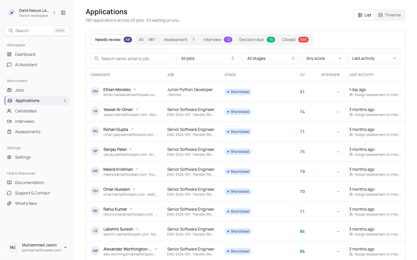
The cross-job list, with job, stage and score filters on top, and a count of what is waiting on you in the subtitle
The tabs are about intent, not status codes. Needs review is what is waiting on you. Assessment and Interview are moving on their own. Decision due is where someone has finished their part and is waiting for yours. Closed is done. All is everything. You can read the queue as a list or as a timeline.
Because a tab name is an intent and not a status, sixteen statuses fold into those six — so each tab now tells you which ones it is holding when you hover it. Hovering Closed, for instance, names what it contains: offer accepted, offer declined, rejected, withdrawn and processing failed. Seeing "Offer accepted" listed under Closed says more, faster, than a sentence explaining it would.
The stage names now match wherever they appear: the tabs read Assessment and Interview, the same words the journey strip and the detail page tabs use — previously the list said "In assessment" and "Interviewing" while everything else said something shorter. All is what you land on, so the count in the header always agrees with the rows beneath it, and searching for a candidate by name no longer comes up empty because a filter you did not set was active. The applications count that used to sit in the sidebar is gone, along with the query that ran on every page to produce it.
Filters, sorting and the page you are on all live in the address bar, so a view you have set up can be bookmarked or pasted to a colleague and it opens exactly as you left it.
A Real Page for Every Application
The side drawer is gone, replaced by a page with room to breathe
Clicking an applicant used to slide a drawer over the job page. Everything had to fit in that narrow column, so the CV lived in one tab and the AI's verdict on it lived in another — meaning you could read the claim or the evidence, but never both at once.
Applications now open as a full page, with one tab per stage of the pipeline, each named after the stage it covers.
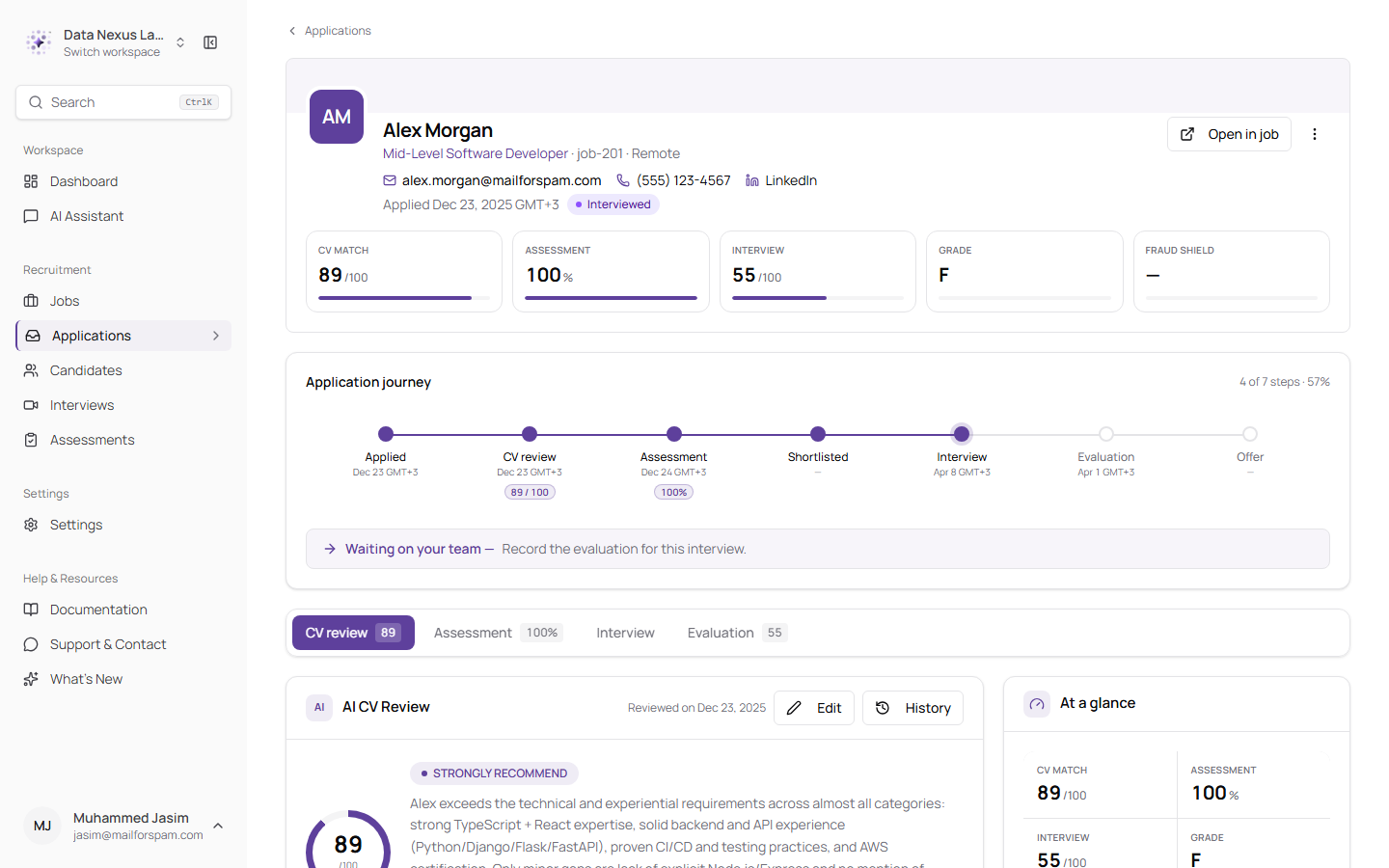
The application page — contact details and headline scores in the header, the journey strip beneath, and stage tabs that stay pinned while you scroll
| Tab | What's in it |
|---|---|
| CV review | The AI's verdict, followed immediately by the CV it was scored against |
| Assessment | The attempt, the score, and the question-by-question breakdown |
| Interview | Everything the interview page shows — schedule, panel, recording, summary, transcript — in one scroll |
| Evaluation | The scoring and the hiring recommendation |
| Fraud Shield | The CV authenticity result and its receipts |
Only the stages that apply to a given candidate are shown, so an application that never went to assessment does not carry an empty Assessment tab.
The header carries the candidate's email, phone and LinkedIn, and an at-a-glance row of the numbers that matter: CV match, assessment, final score, grade and fraud label. Down the right-hand side sits an activity feed of everything that has happened, a card listing the candidate's other applications to you, and a plain "what's next" line derived from where they actually are.
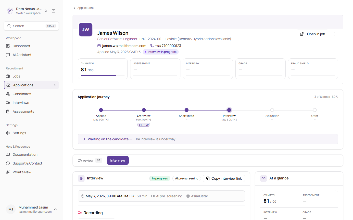
*The Interview tab — status, meeting type, schedule and recording in one scroll, with Copy interview link in the card header while the interview is still open*
The actions menu is now one menu, used in both places. Previously the job row had a set of actions and the drawer had a different, smaller set, so opening an applicant quietly took options away from you. Whatever you can do from the row, you can now do from the page.
The decision itself moved with it. The detail page used to show you every score behind a hiring decision and then give you no way to make one — it would even tell you "Evaluation is complete — send an offer or reject" while offering neither button. Assign Interview, Complete Interview, Evaluate Candidate and Send Offer live on the applicant row, and that same row of controls now appears in the header of the application page, under the same conditions. Reading an application and acting on it are no longer two different screens.
Copying a candidate's interview link is one of those actions, and it now sits in the Interview tab header as well — visible while the interview is scheduled or under way, and hidden once it is finished, so you cannot send someone a link that no longer opens anything.
A Journey Strip That Tells the Truth
Where the application actually stopped, not where the ideal path would have gone
The strip across the top of an application is meant to answer one question: how far did this person get. It was answering it badly in two ways.
A rejected candidate always had the Shortlisted stage marked as the failure, wherever the rejection actually happened — so someone rejected after a poor assessment was shown as having failed the CV screen, which contradicted the rejection reason printed further down the same page. And because the strip only ever drew the full seven-stage pipeline, an application that had ended still showed the stages it would never reach: a rejected candidate read as "5 of 7 steps · 71%", with an Offer step politely waiting for them.
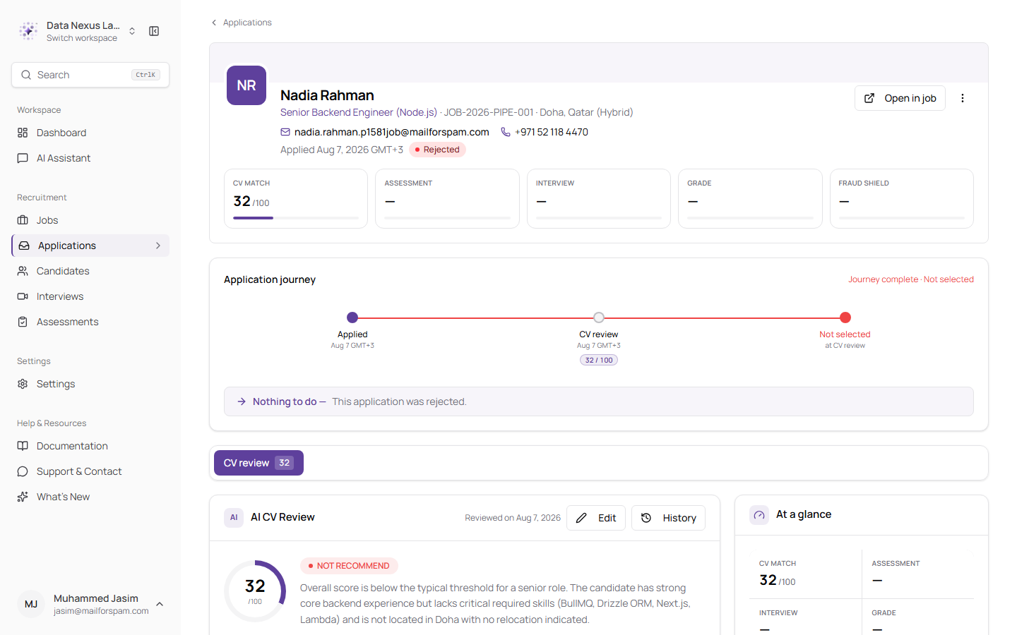
A concluded application now ends where it ended — the unreachable stages are dropped and the final step names the outcome, the stage it happened at, and the date
Applications that are still moving are unaffected — they show the road ahead as before. Only concluded ones stop.
Two related fixes sit alongside this. Editing a CV review no longer re-runs the initial screening decision, so correcting a score on a candidate already at Interview or Offer no longer drags them back to Shortlisted. And Remove now works on an application in any status — it was offered on every row but only ever succeeded on rejected ones, returning a generic error for the rest.
The Pages Your Candidates See
A calmer public job page, and an application form that opens where you are
The candidate-facing side of the product has been reworked into a quieter, near-monochrome layout, with the coloured emphasis blocks replaced by plain cards.
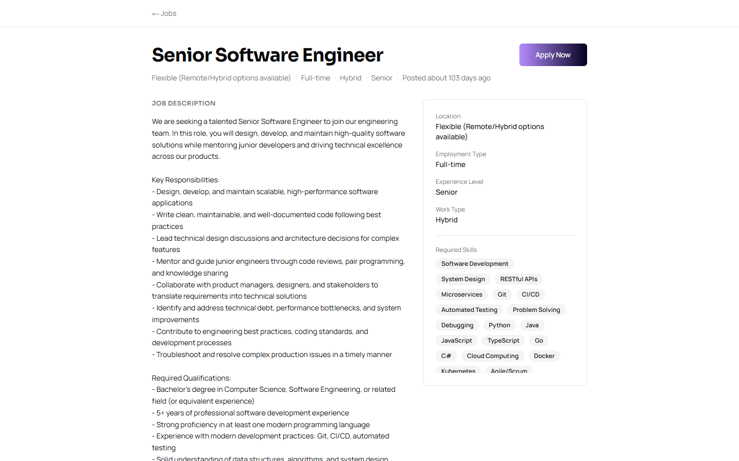
The public job page — the role, its meta line and Apply Now sit in a header that stays with you as the description scrolls, with the details in a neutral card alongside
Applying no longer sends the candidate to a separate page. The form opens as a dialog on desktop and a bottom sheet on mobile, so the job description stays behind it and the applicant keeps their place.
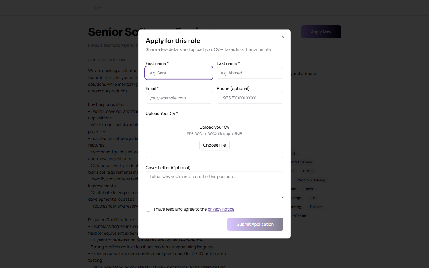
The guest application form, opening in place over the job it belongs to
Job details are also written properly now. Job type, work mode and seniority are rendered from a shared set of labels rather than printed as raw values, so applicants read "Full-time" and "Hybrid" instead of "full time" and "hybrid". A few small embarrassments went with the redesign: a salary range with only an upper figure no longer reads "USD undefined - 70,000", and a remote role in a remote location no longer prints "Remote - Remote".
The tracking page a candidate lands on after applying got the same treatment — the same timeline, rebuilt as plain neutral cards.
There is also now a Terms of Service page. The links to it in the website footer and at the bottom of candidate emails previously went nowhere — or, worse, bounced the recipient to a login screen they had no account for. Both `/privacy` and `/terms` are now open to anyone with the link, which is what an email footer needs them to be.
Passcode-Protected Candidate Links
A forwarded link no longer lets someone else sit the interview
An interview or assessment invitation is a plain web address. Anyone who has it can open it — which means anyone the candidate forwards it to can open it too, and take the assessment in their place.
Those links now ask the visitor to prove who they are. Opening one first asks for the name and email on the application, then sends a six-digit code to that address — shown partly masked, as `sa••••••••@example.com`, so the real candidate recognises their own inbox while a link holder learns nothing new about it.
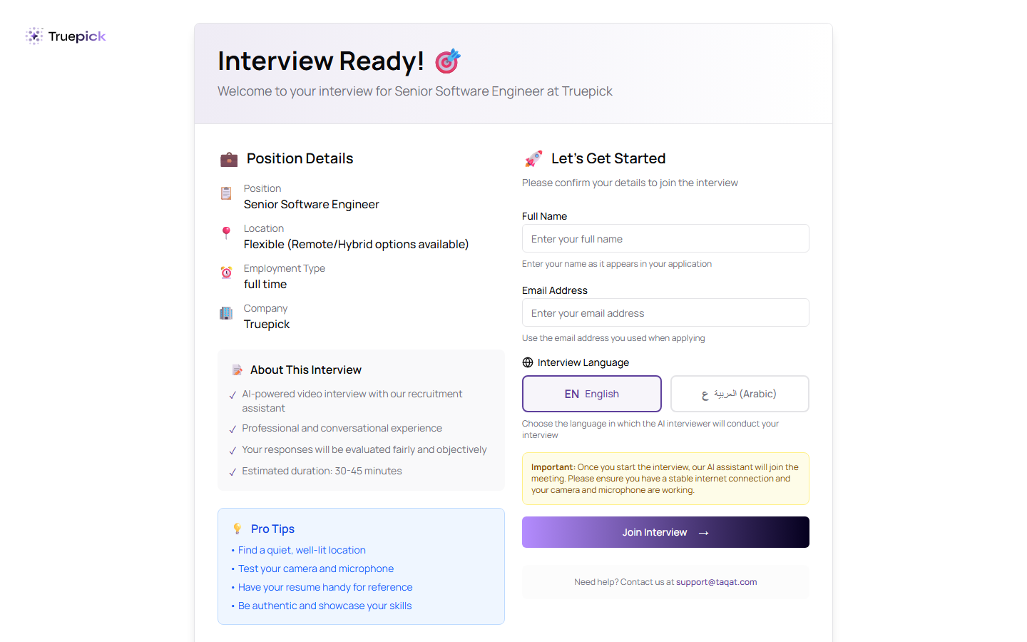
The interview link now opens on a confirmation step rather than straight into the room — the emailed passcode follows
The assessment link works the same way, and is careful about the candidate's clock.
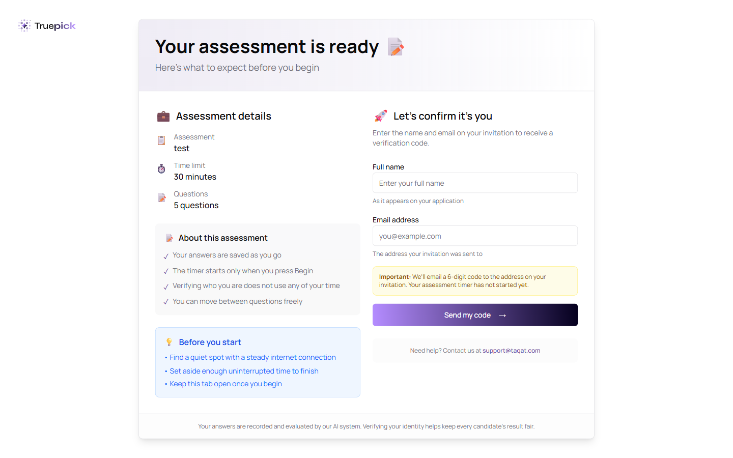
Before anything else, the assessment link asks for the name and email on the invitation, and says plainly that the timer has not started yet — proving who you are never eats into the thirty minutes
The rules are the same for interviews and assessments:
| Code length | Six digits |
| Valid for | 10 minutes |
| Wrong attempts allowed | 5, then the link locks |
| Lockout | 15 minutes |
| Resend | Once a minute, up to 5 codes an hour |
Codes are never stored — only a one-way hash of them — and the limits are enforced by the database rather than the browser, so opening the link in several tabs at once does not multiply the allowance. Once verified, the candidate carries on into the interview or assessment as before. If that verification lapses part-way through, they are shown the passcode step again rather than an error they cannot get past.
Search That Actually Finds Things
⌘K from anywhere, across everything
The old search matched text against three tables and returned whatever came back first. It had no ranking, so a candidate whose name you typed in full could sit below someone who merely had the letters somewhere in a job title.
Search is now a command palette. ⌘K (or Ctrl+K) opens it from any page, and it searches five things at once: candidates, jobs, interviews, assessments and past conversations with the assistant.
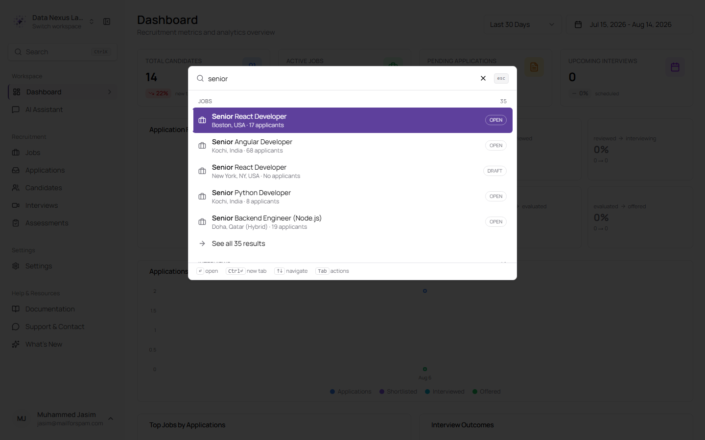
Results grouped by category — jobs and past conversations here — with the option to save the search. Recent and saved searches appear when the box is empty
Results are ranked before they are cut down, so the best match is the one you see rather than the one that happened to be found first. Arrow keys move through them, Enter opens, and Tab switches into an action mode where you can act on a result without opening it.
Arabic search has been rebuilt around how people actually type. Alef, taa marbuta and alef maqsura variants are treated as the same letter, tashkeel and tatweel are ignored, and Arabic-Indic digits match their Western equivalents. It also searches across scripts: typing `Ahmed` finds `أحمد`, and typing `أحمد` finds `Ahmed`. And when nothing matches, the palette offers to hand your query to the assistant instead of just shrugging.
Your recent searches are kept, and a search you run often can be saved.
Bulk Upload, for the Pool and with a Panel
Import CVs without pinning them to a job, and cancel the ones you didn't mean to send
Bulk CV upload previously only existed inside a job — every CV you imported became an application to that job, was scored against it, and was invited to its assessment. There was no way to simply add a batch of CVs to your candidate pool.
There is now. Add Candidate and Bulk Upload have been merged into one button on the Candidates page, and upload history moved to a labelled button beside it instead of taking up the side of the page.
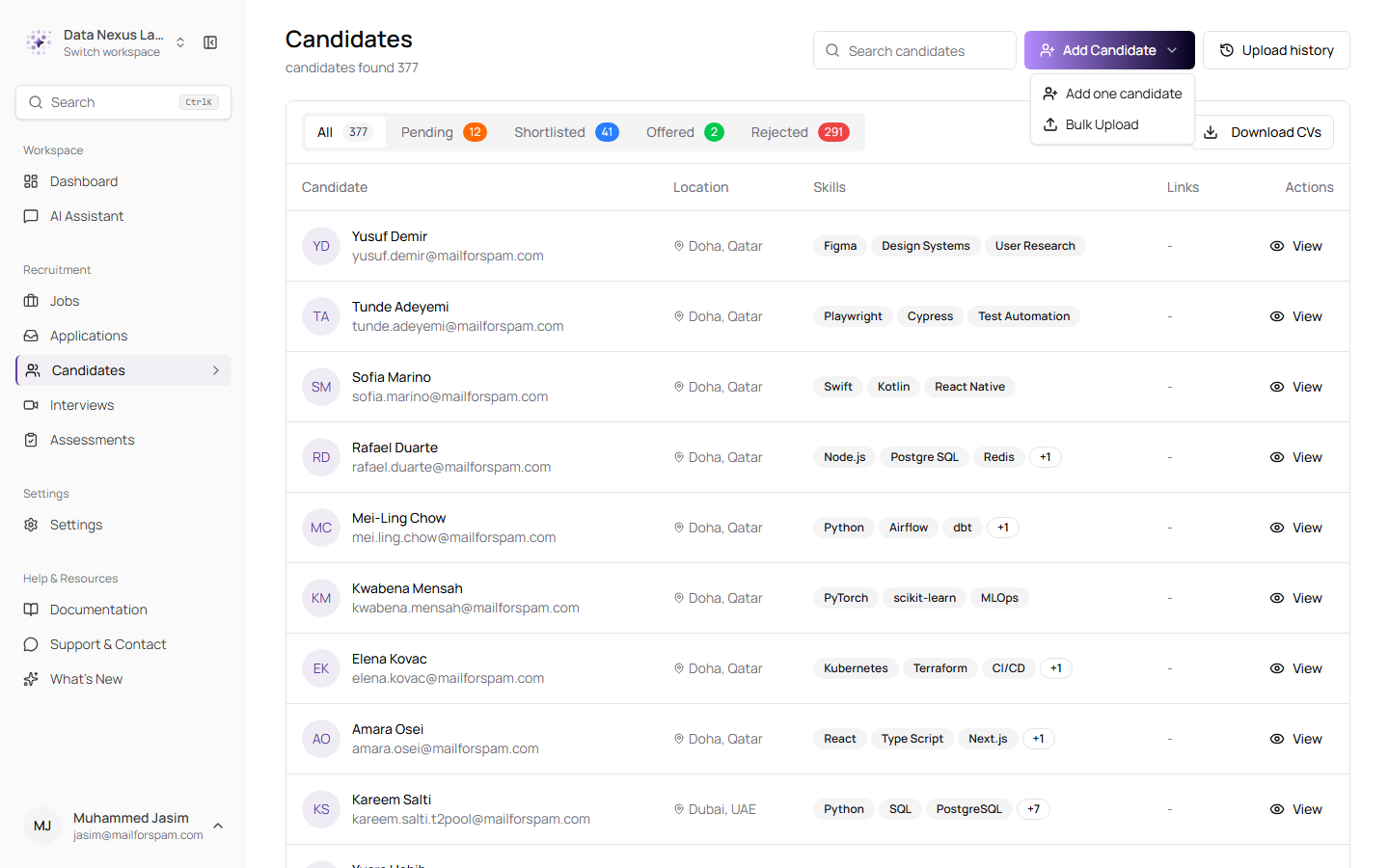
One button for both ways of adding people, with upload history next to it
Bulk Upload imports straight into the pool, skipping the job-only work: no application, no AI scoring, no assessment. That also makes it materially cheaper per CV.
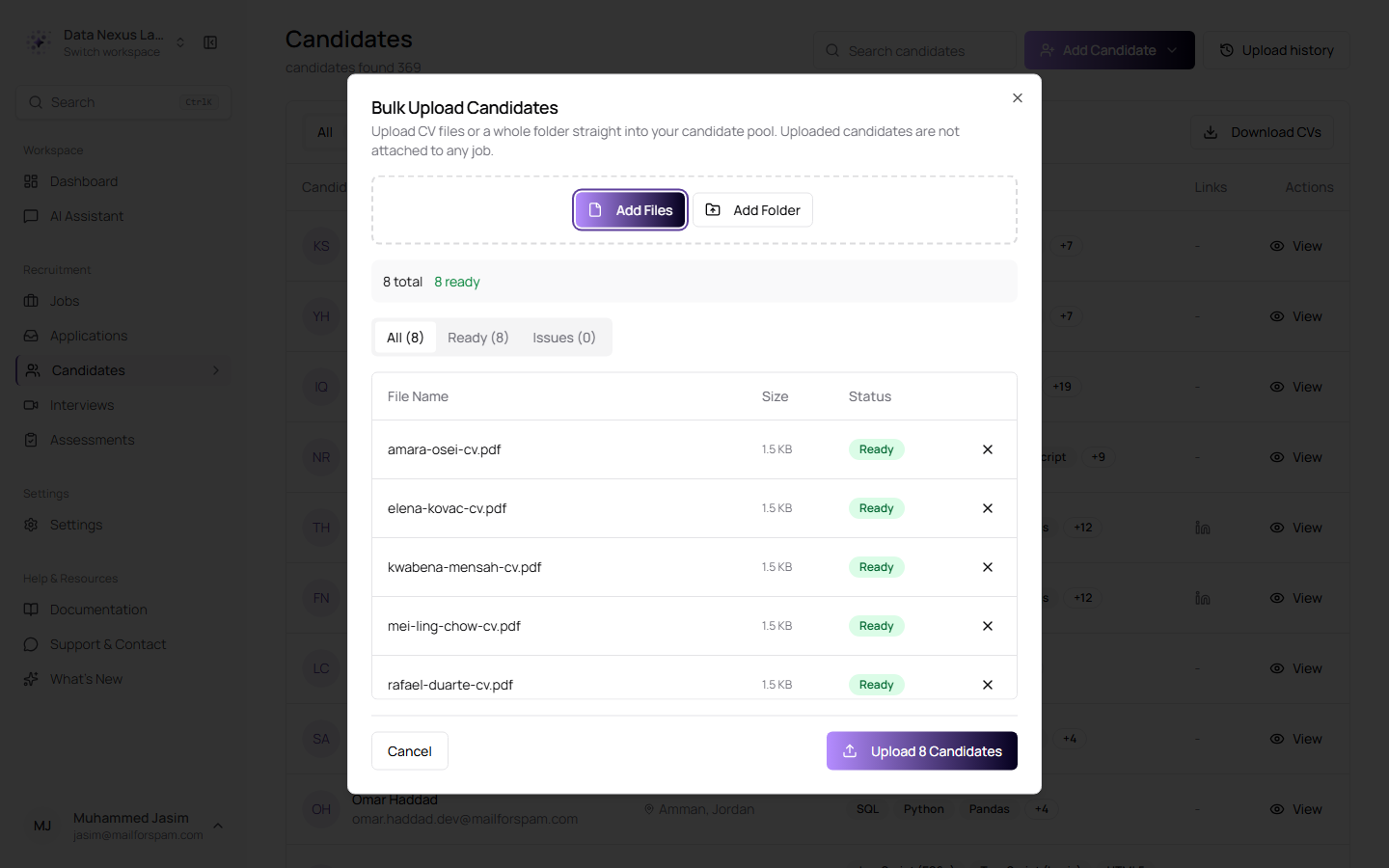
Drop in files or a whole folder — up to 400 at a time. Everything is checked before a single byte is sent, so anything unreadable shows up under Issues rather than failing halfway through
The upload experience itself has been rebuilt. The activity panel that used to occupy the side of the Candidates page is gone, replaced by a compact manager docked in the bottom-right corner that you can collapse and keep working around.
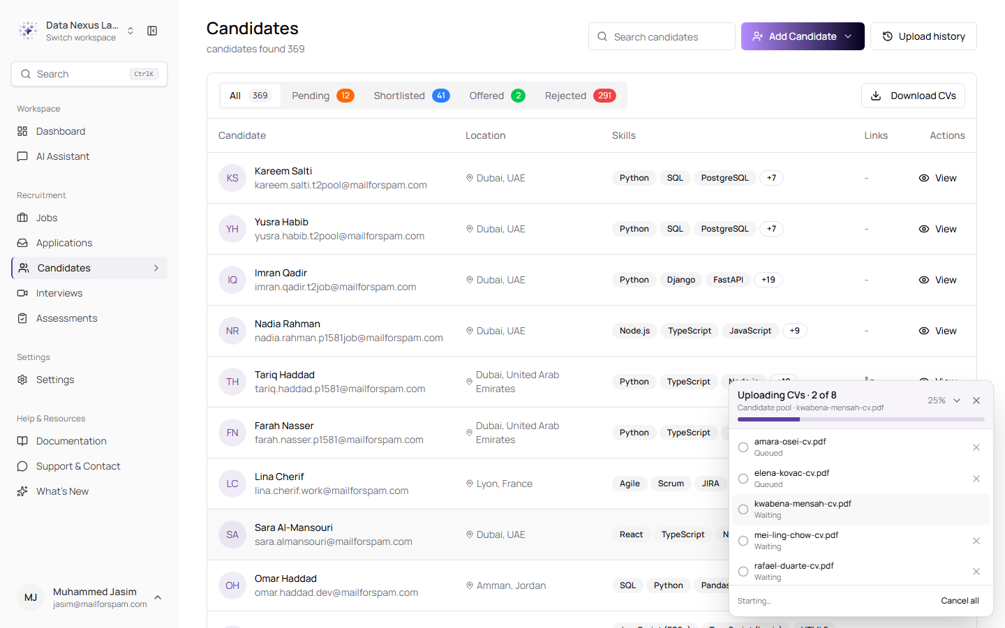
Overall progress at the top, each file beneath it with its own state, and a cancel button on every row — the rest of the page stays usable while it runs
Each file can now be cancelled on its own, at any point — while it is still uploading, while its CV is being read, or before the candidate record is created. A cancelled CV never reaches your pool. Cancel all stops the batch, Retry failed re-queues only the ones that did not make it, and once a batch finishes, anything with a problem sorts to the top so you are not hunting for it.
Cancelled is kept distinct from failed throughout — it gets a neutral badge, it is left out of retries, and it counts as resolved rather than sitting in your failure count.
Every batch you have ever run is kept, and Upload history in the page header opens the lot.
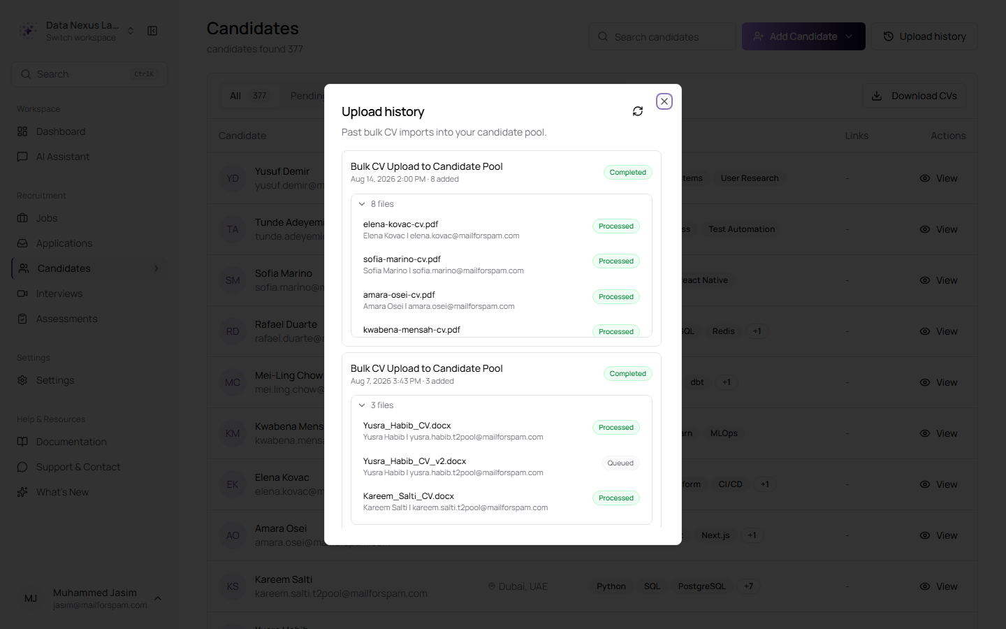
Each import, expandable to the file level — what was processed, what was queued, what was a duplicate, and what failed, with the reason
One Clock for the Whole Company
Set your workspace's timezone once, and every date follows it
Dates were being rendered several different ways depending on which screen you were on: some in your browser's timezone, some in the timezone stored on the record, and one screen with `Asia/Qatar` written into the code with an "AST" suffix stuck on the end. On interview screens this was at its worst — the list showed a time in your zone plus a second line saying "originally scheduled…" in another, and the detail page showed the stored zone with the raw timezone name printed separately beside it. One interview, two times, and no obvious answer to "so when is it".
Company Profile settings now has a timezone field, and everything in the app reads from it.
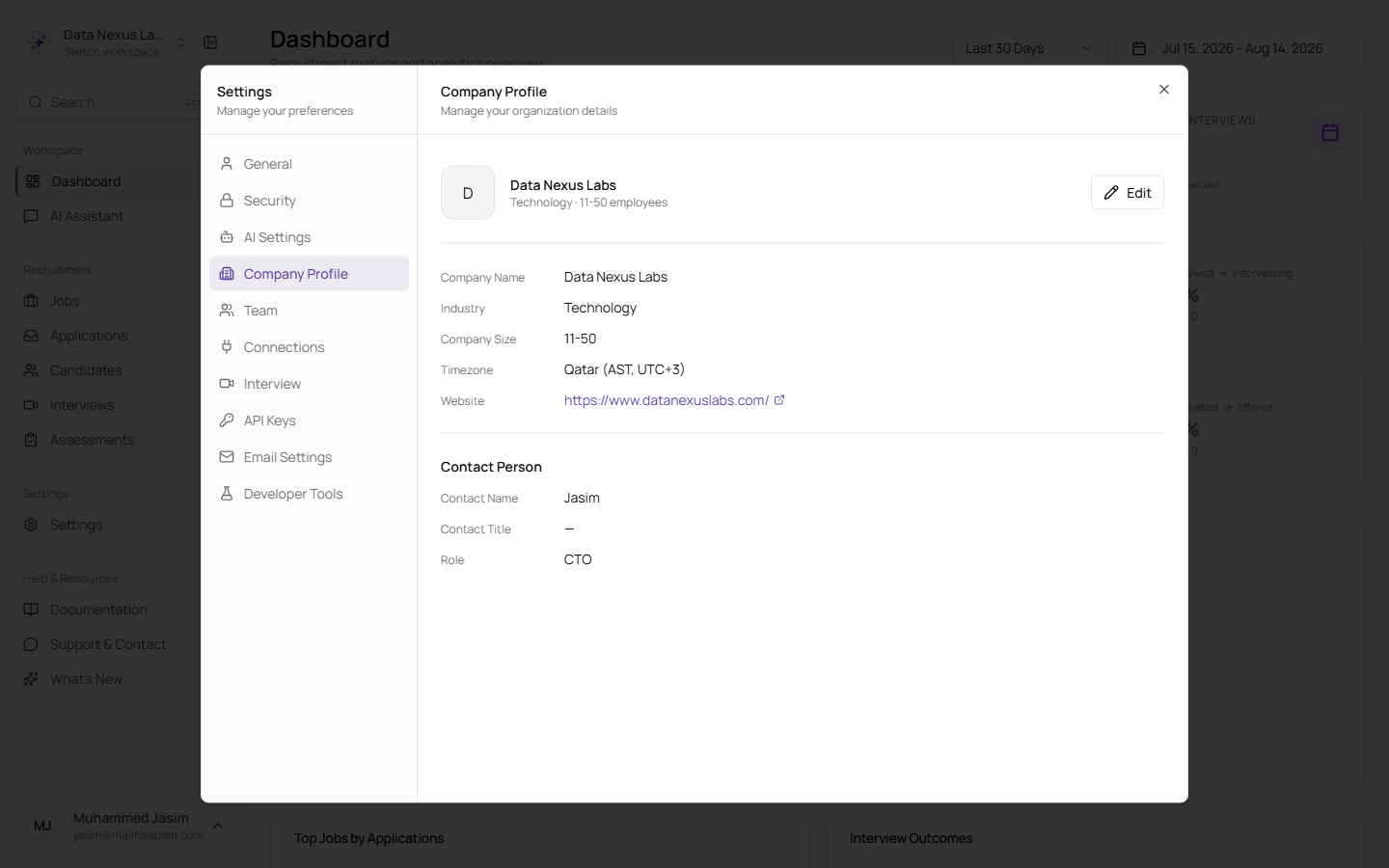
One setting, applied across activity timelines, application pages, candidate records, job applicant lists, the dashboard, the interviews list and the interview page
You see one time, in your company's zone. A short zone label like `GMT+3` is added only when your own browser is in a different zone from the company's — so nobody in the office sees clutter, and a colleague dialling in from elsewhere is not misled.
One screen still stands outside this: the Calendar view on the interviews page continues to draw its slots in your own browser's timezone, without a zone label. Switching a single interview from the list to the calendar can therefore show two different clock times for it. That is on the list to bring in line.
Interviews Nobody Attended
A candidate who never turns up no longer stalls the pipeline forever
An interview is created as Scheduled and only leaves that state because somebody does something: the candidate joins, or a recruiter marks it completed or cancelled. Nothing moved it when the candidate simply never appeared. The interview sat as Scheduled indefinitely, and so did the application behind it — which, in an automated pipeline where nobody is watching individual applications, meant the candidate quietly disappeared from the process altogether.
The app now checks for these and closes them.
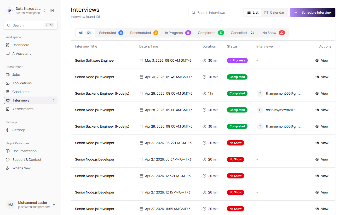
No Show joins Scheduled, Rescheduled, In Progress, Completed and Cancelled as a status you can filter by — and every row carries one time, in the company's zone
When one is detected, the interview is closed and the application returns to Shortlisted, where you can see it and decide what to do.
How confident the app is depends on the kind of interview, and that distinction decides who gets told:
- AI interviews are instrumented — the system records the moment a candidate enters the room. A scheduled AI interview whose slot has passed is real evidence nobody joined, so it is treated as a confirmed no-show after a 30-minute grace period, and the candidate is notified along with your team.
- Meet, Teams, Zoom and in-person interviews have no attendance signal at all. A still-scheduled row means only that nobody recorded an outcome — the candidate may well have attended and the interviewer simply never updated it. These are treated as unrecorded, get a 48-hour grace period so there is time to record the outcome yourself, and are never emailed to the candidate. Only you and the interviewer hear about them.
The rule behind that last point is deliberate: nobody is ever told they missed an interview on the strength of paperwork somebody forgot to fill in.
Two related dead ends are closed as well. A candidate's join link now stops working once the interview is over, and the Copy interview link button disappears at the same moment, so a finished interview can no longer be sent to anyone as though it were still open.
A Better AI Interviewer
It has a role, not a first name — and it will not be talked off topic
An interview conducted by the AI was introducing itself with a name. Worse, the name changed: one interview was conducted by "Aisha" and transcribed as "Nura" — two different names for the same speaker in a hiring record that might later be reviewed for fairness, under personas nobody had agreed to.
There were two separate causes. One name was written into the transcript viewer as a fixed label. The other was never in the product at all — the interviewer had been told to behave like "a real person having a genuine conversation, not a robot" and to be creative when introducing itself, so the model made up a first name, and a different one each time. The interviewer is now identified by its role, consistently, wherever it appears.
The interviewer also holds its ground now. Candidates were able to ask it anything — cooking, coding help, general knowledge — and it would answer, spending interview time on it and filling the recruiter's transcript with the results. More seriously, they could probe it for the evaluation criteria, the scoring, the expected answers, or its own instructions.
An off-topic question now gets one short, courteous line steering back to the current question, and the interview resumes where it left off — the detour is not held against the candidate. Questions about criteria, scoring, weighting, model answers or how the candidate is doing are declined however they are framed, whether asked directly, as a joke, or wrapped in a hypothetical. Attempts to overwrite the interviewer's instructions do not work. Genuine questions about the role and the process are still answered as normal, and where the interviewer does not know something — salary, start date, remote or onsite — it says so and points to the recruiter rather than inventing an answer. This applies to both English and Arabic interviews.
Assessments
Screen-leaving is detected, and Clone and Edit finally do something
An online assessment taken unsupervised has an obvious weakness: nothing stopped a candidate from opening another tab and looking up the answer. Assessments now watch for it, and the candidate is told so before they start.
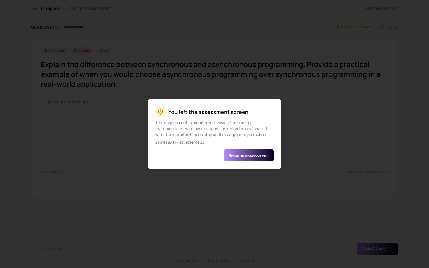
The candidate is stopped, told plainly what was recorded and how many times, and let back in — with a running count in the header the whole time
Switching tabs, moving to another window, or leaving the page is recorded as an away spell. The candidate gets a warning each time, up to three; a fourth ends the assessment and submits what they have done. Termination sits one step beyond the last warning on purpose — the final warning should be a chance to correct course, not an announcement that it is already too late.
The detection is deliberately forgiving of things that are not cheating. Focus loss shorter than four-tenths of a second is discarded, because OS notifications, password managers and file pickers all steal focus for a moment. The browser's own camera and microphone permission prompt — which blurs the window through no fault of the candidate — is excluded entirely. Three or more away spells flag the attempt for your review, and the full count is visible on the attempt when you open it. One switch is plausibly an accident; three is a pattern.
Three smaller assessment fixes ship alongside:
- Clone in the assessment row menu had a label and an icon and no action behind it at all. It now clones.
- Edit now opens a dialog from the row menu, using the same validation as the full editor, so a quick change no longer means loading the whole editing screen.
- Choice options can be deleted. The delete control was disabled while a question had two or fewer options — and since a new question grows from none to one to two, its first two options could never be deleted, only typed over. It was also invisible until hover, so it did not exist on a touchscreen, and it had no accessible name for screen readers. All three are fixed.
The Assistant, Sharpened
It shows you an assessment instead of describing one, and it sticks to recruitment
Asking the assistant to draft an assessment used to produce a wall of raw markdown in the chat — literal `#`, `##` and `**` characters where headings and bold text should have been. A draft assessment is now streamed as a structured card you can actually read and check.
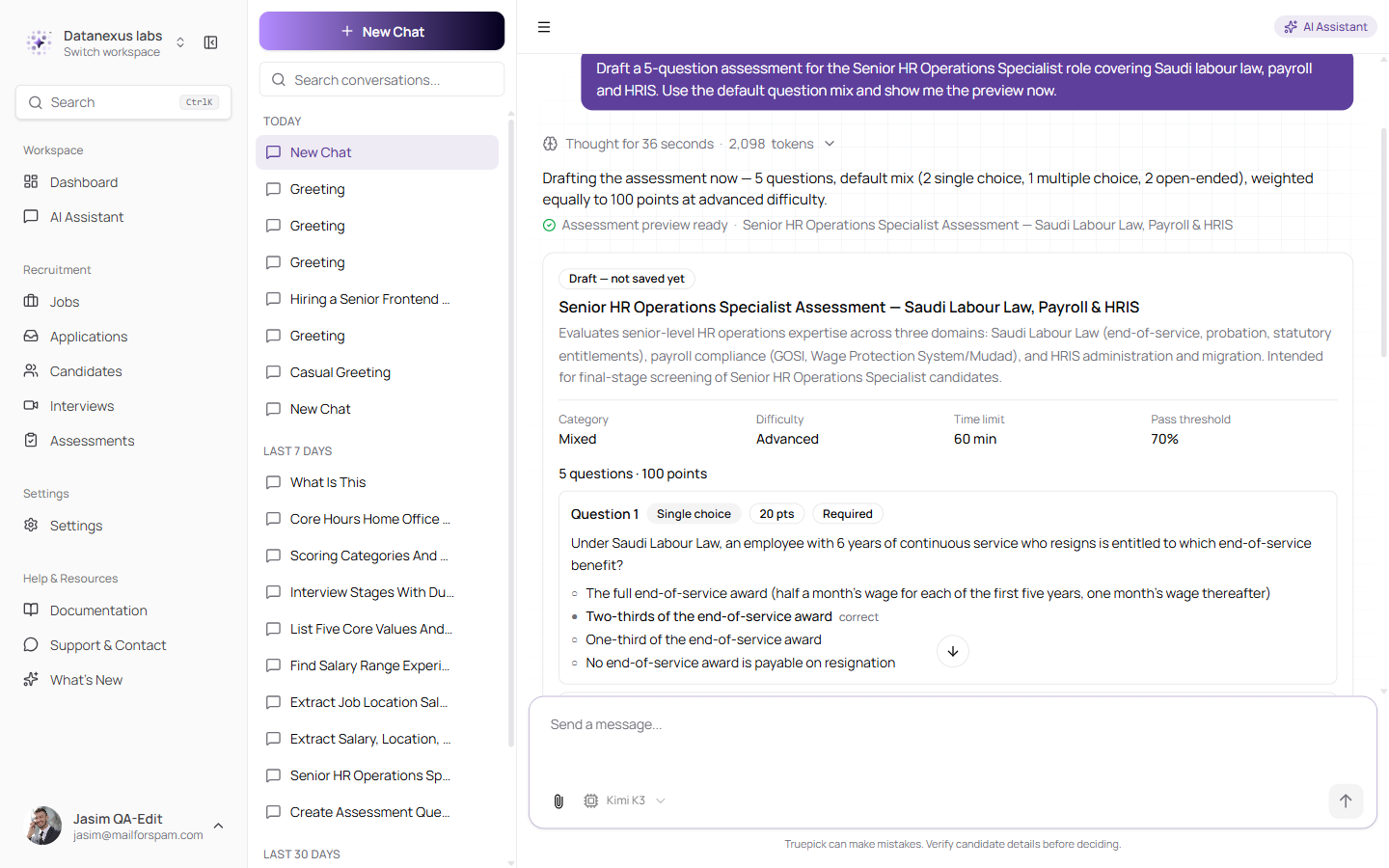
Marked "Draft — not saved yet": category, difficulty, time limit and pass threshold at a glance, then every question with its type and points. Nothing is written to your workspace until you say so
The assistant also now stays on recruitment work. Asked how to make a burger, it used to return the recipe: off-brand, spending real money on nothing, and an open invitation to treat the chat as a free general-purpose bot. Off-topic requests now get a polite refusal that points back at what it can help with, written in whichever language you asked in. Drafting job descriptions, interview questions and rejection emails remain firmly in scope — a boundary that refused those would be a worse problem than the one it fixes. And if the check itself ever has trouble, it lets the message through rather than taking chat down.
Finally, asking the assistant to change a job's assessment expiry now works. The value is also checked properly on the way in, so an out-of-range number cannot be stored.
A Refreshed Model List
Six current models, plus Taqat LLM by name
The model list in AI Settings had gone stale, and Taqat's own privately hosted model was still listed under the name of the model behind it. Both are fixed. The list is now a plain, flat set of seven:
Taqat LLM · Muse Spark 1.2 · Kimi K3 · Claude Haiku 4.5 · GLM-5.2 · GPT-5.6 Luna · GPT-5.4 Mini
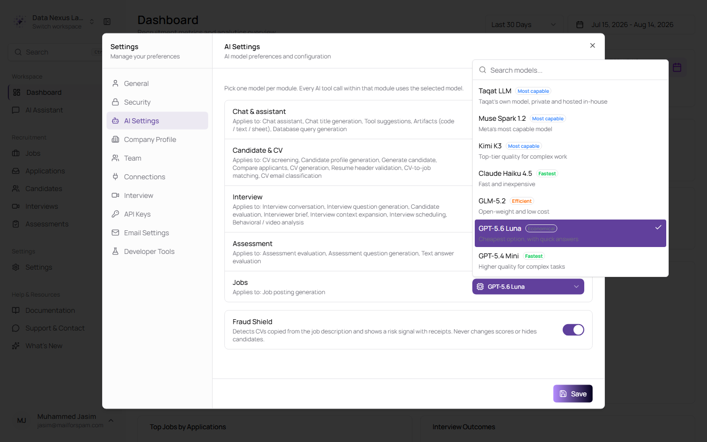
Each AI area picks its own model from the same searchable list, each with a plain description — and the ones that cannot do the job for that area are left out
Each row now says the one thing that separates that model from the others — "Taqat's own model, private and hosted in-house", "Fast and inexpensive", "Open-weight and low cost" — instead of ending in a clause about which file types it can read. Wherever image support actually matters, the list is already filtered to models that have it, so repeating "handles images" on every remaining row told you nothing.
Two of the seven cannot read images, so they no longer appear where attachments are possible — previously a model without image support could be selected for chat and would then fail the first time anyone attached a picture. Every price, context size and capability in the list was read from the provider directly rather than copied from a spec, which turned up two that had been quoted too high.
Workspaces still holding a model that has since been retired used to see an empty dropdown — the saved value matched nothing, so nothing was shown. The screen now falls back to a valid model for display, without silently rewriting what you had saved until you choose to save again. The default across chat and the AI settings areas has moved to GPT-5.6 Luna, which is cheaper than the model it replaces, with a larger context window and full tool and image support.
Matching and Candidate Lists
The Suggested tab was throwing away the entire candidate pool
Candidate matching on a job's Suggested tab was returning nothing, and there was no clue as to why. The cause sat in the filter that runs before the AI ever sees anyone: a candidate had to match a keyword in the job title and have a skill that matched one of the job's skills exactly, character for character.
Candidates write their skills in their own words — "Workday HCM", "GOSI contributions", "WPS / Mudad filing" — and a job description writes them in its own: "GCC compliance: WPS/Mudad, GOSI, iqama/visa renewals". Those never match exactly, so the overlap was zero, so the whole pool was discarded before the AI ran, and the tab came back empty.
Matching now works on individual words drawn from both the title and the skills, treats them as alternatives rather than requirements, and ranks each candidate by how many of them they hit. The hard rules — same company, not already applied or suggested — still apply as before. On a real job this took the pre-filter from nothing to 50 candidates reviewed and 5 qualified, with a clear gap between the qualifying scores and the rest.
Runs behave properly too. A run that gets stuck now fails and says so rather than sitting at 0% indefinitely, Cancel actually stops one that is in progress, and only one run per job can be active at a time — so a refresh, a second tab, or another recruiter starting the same job sees the run already under way instead of starting a competing one.
On the candidate side, the Skills card is no longer an unscannable wall of tags. Once a candidate has more than ten skills a search box appears, so you can answer "do they have X" without reading the whole list, and lists longer than twenty-four collapse behind a "Show all" control.
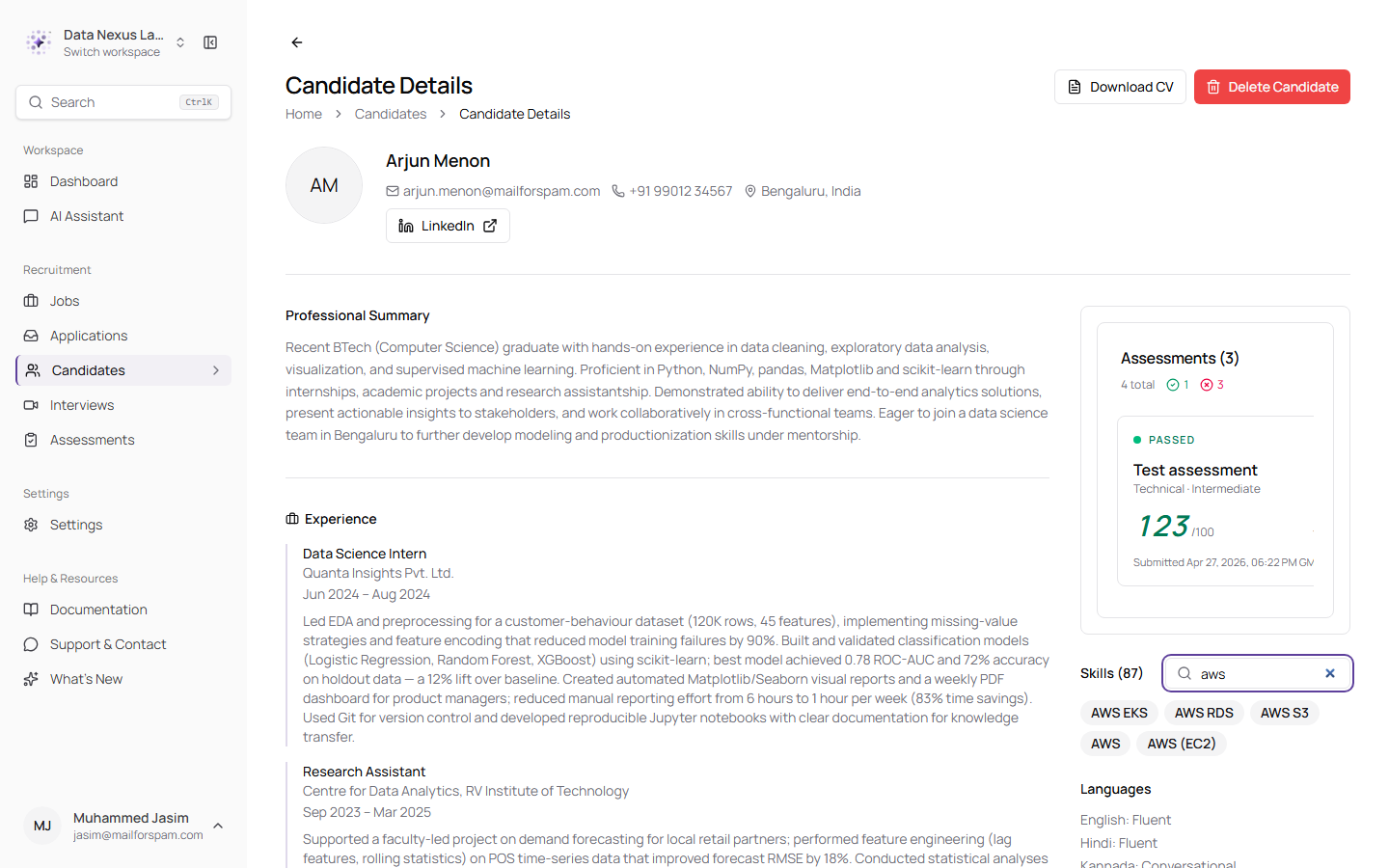
Eighty-seven skills, narrowed to the five that matter in one keystroke — with the total in the header and a Clear search reset when nothing matches
Skills that differ only by capitalisation or spacing are now shown once.
Improvements
- Candidates get told their assessment arrived. Submitting an assessment used to end in silence — the candidate had no way to know whether their answers reached you. They now receive an "Assessment received" email naming the role, the assessment and the time it was submitted in your company's timezone, with a line saying your team will review it and that nothing further is needed from them. It deliberately carries no score.
- The job form stopped asking a question that never mattered. The Assessment Configuration section had a "Require assessment on application" checkbox that only appeared once you had picked an assessment — and picking one already ticked it. The one state it could still express, *assessment attached but not required*, is indistinguishable from having no assessment at all anywhere in the pipeline. The checkbox is gone and requiring the assessment now simply follows the selection. The redundant "(Optional)" tag came off the heading and the picker at the same time.
- The interviewer email field explains itself when it is wrong. Leaving it empty or typing a malformed address used to fail silently; you now get "Add at least one interviewer email" or "Enter a valid email address" beside the row you typed into, and blank spare rows are ignored rather than flagged.
- The upload progress bar is readable again. Mid-upload the bar was painting a gradient over its own fill, so the one thing it existed to show — how far along you were — washed out. The docked manager now uses a lighter header and a solid purple fill on a faint track.
- Automated pipelines no longer email three times in a minute. A candidate processed end to end by the automated pipeline received an application confirmation, a "you're moving forward" note and an interview or assessment invitation back to back, all within the same minute — which reads as robotic and rather gives away that no human looked at the application. The redundant middle email is now suppressed when a richer invitation is about to follow. Manual recruiter actions are untouched.
- Transcripts and recordings download for everyone in the workspace. Both downloads were checking whether you personally created the job rather than whether you belong to the workspace, so a colleague who had not created it hit a permission error on an interview that was plainly their own team's.
- Meeting-link failures explain themselves. When a Google Meet, Teams or Zoom link cannot be created, the reason is now surfaced instead of the action failing without explanation.
- Interview invitation emails read properly. Job type, work mode and seniority render as words rather than raw values, the steps in the email line up, the footer links to privacy, terms and contact actually work, and the copyright year is the current one.
- The interview detail page is properly translated, including right-to-left layout in Arabic.
- Your interviews view is remembered. Choosing Calendar, opening an interview and coming back used to land you on List again; the choice is now kept per person, per workspace.
- Live interview screens carry the right branding — the footer on the candidate's interview screen now shows the real Truepick mark.
Released on August 14, 2026
View all releases