This release adds a board view for tracking applicants through your pipeline, and makes the AI interviewer noticeably more reliable.
The Candidates tab on a job now has a Board view alongside the existing table. Every stage of the pipeline — In Review, Shortlisted, Assessment, Interview Set, Interview Done, Decision Due, Offered, Accepted, Not Proceeding — is always visible as a column, even the empty ones, so a job's roadmap is legible at a glance. It reads the same data as the table; there's no dragging cards around, because nothing on the board can change without something happening first — an assessment assigned, an interview held, an offer sent.
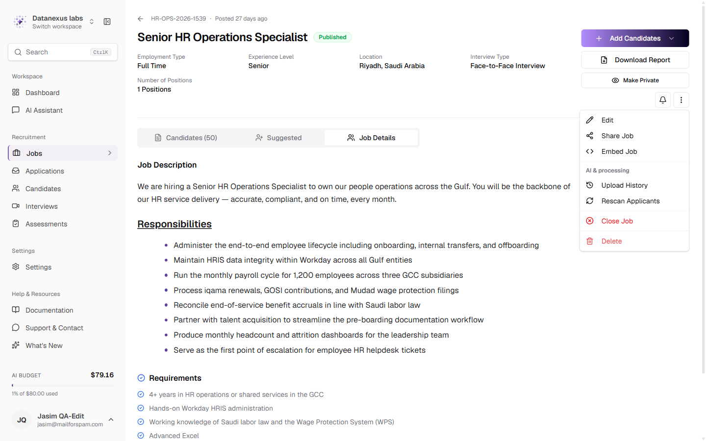
The job header was redesigned. The scattered chip row is now a labelled grid — Department, Level, Location, Interview Type and the rest read as a record instead of a row of tags — and the actions beside it are grouped by how often you reach for them, with Edit, Share and Embed up front and the rarer actions behind one "More actions" menu.
The AI interviewer is more reliable. Push-to-talk interviews no longer occasionally reply twice to the same answer or cut a candidate off mid-thought. A tone guard now catches praise and commentary the model tries to slip in through a second clause, not just an opening word. Saved transcripts are complete and don't duplicate. And before a candidate can join an interview at all, they now have to prove their camera and microphone actually work.
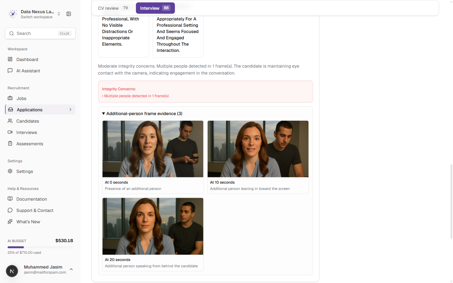
Editing a completed evaluation is safer, and when behavioral analysis flags a second person in frame, you can now see the actual video frame it flagged instead of taking its word for it.
See every stage of a job's pipeline at once
The Candidates tab on a job has shown a table since the beginning — useful for scanning and filtering, but it answers "who is where" one row at a time. It doesn't show you the shape of a hiring round: how many are stuck in review, how many are one step from an offer, whether the pipeline has emptied out downstream.
A Board toggle sits next to Table above the applicant list. Switching to it lays out every application as a card in the column for its current stage — In Review, Shortlisted, Assessment, Interview Set, Interview Done, Decision Due, Offered, Accepted, Not Proceeding — left to right in pipeline order.
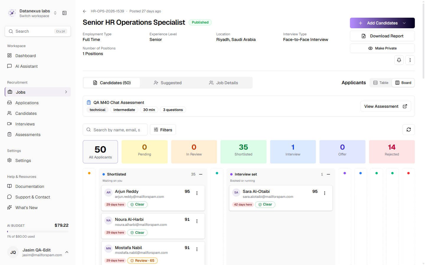
Every stage is always there, even at zero. A column with nothing in it collapses to a 44px rail rather than disappearing, so the board doubles as the job's roadmap — a recruiter looking at a stack of Shortlisted candidates can see that Assessment, then Interview, then Offer come next, before anyone has reached them. The Assessment column only appears at all for jobs that actually use one.
There is no drag. A column is where an application *is*, not a lever that moves it — every stage is reached because something happened (an assessment assigned, an interview held, an evaluation run, an offer sent), and the board simply reflects where those events have put everyone. What changes an application is the same row menu the table already has, on each card.
Table stays the default everywhere. The board is an addition; switching to it is a per-view choice, not a new default that changes anyone's page without them asking for it.
The job's facts as a record, and its actions grouped by how often you reach for them
The strip of chips under a job's title — Department, Employment Type, Level, Location, Interview Type — read as a row of filters to anyone who didn't write the job. It's now a labelled grid: "Level: Senior" instead of an unlabelled "Senior" chip sitting next to "Hybrid."
The header's actions are grouped the same way. Add Candidates, Download Report and the job's visibility toggle stay in view because they're used often. Everything else — Edit, Share, Embed, Upload History, Rescan Applicants, Close, Delete — sits behind one More actions menu, grouped by purpose rather than listed flat.
No more interviews that recorded silence or a black rectangle
Before this release, a candidate could join an AI interview with a muted microphone or a blocked camera and never know until a recruiter opened the evaluation later — by then the interview had already happened, and there was nothing left to score.
The join screen now runs two checks before letting a candidate in:
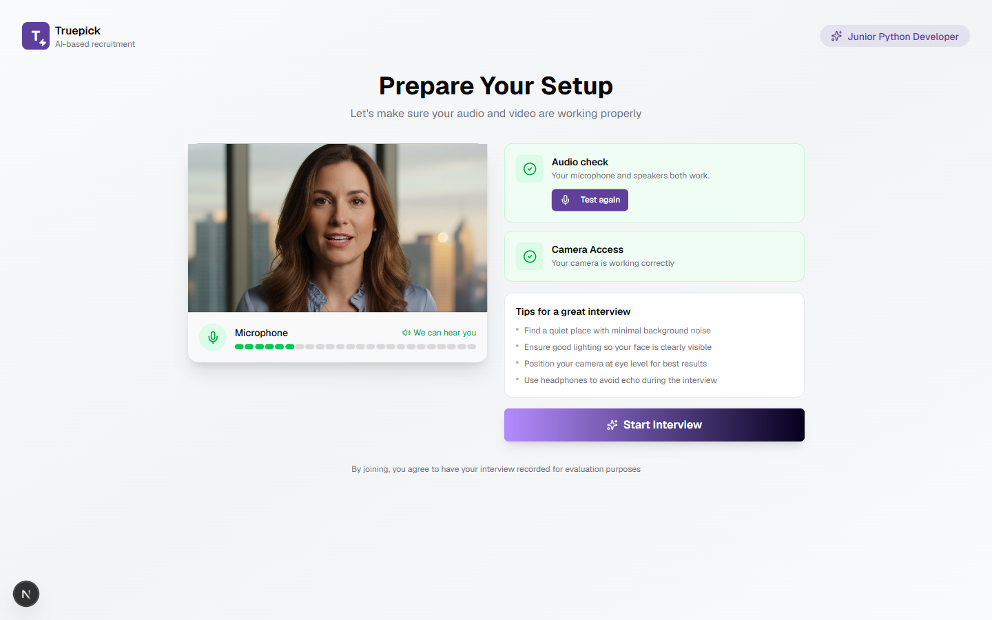
Joining is gated on both. A candidate who hasn't granted access, whose device failed the test, or whose camera never produced a frame sees exactly which check is blocking them and why, instead of being let into a room that can't hear or see them.
Fewer double replies, no more slipped-in praise, complete transcripts
Three separate reliability fixes went into the interview agent this release:
When it flags a second person in frame, you can now see the frame
The evaluation panel's behavioral analysis already told you when it detected someone other than the candidate in view. It now shows the actual video frame behind that flag — the moment it triggered on, with its suspicious indicators — in an expandable section, instead of a text description you had to take on faith.
صدر بتاريخ 18 سبتمبر 2026
عرض كل الإصدارات